5 Elements to Avoid on your Landing Page
Learn from other people's mistakes and avoid these top landing page "don'ts" including carousels, large images, false footers, hidden CTAs, and jargon.
Over the years, people have tried various layouts and concepts for their landing pages. There have been a whole lot of successes and just as many failures. Beyond knowing “what works,” it’s important to know what doesn’t work so you don’t make the same mistakes on your landing page. In this post, we’ll cover five of the top landing page “don’ts” so you can learn from other people’s mistakes.
Don’t use carousels or rotating sliders to display content
Surprised by the first don’t? You might be! After all, many websites still feature carousels and rotating images at the very top of their homepages. However, it’s no longer considered a best practice.Carousels that automatically rotate content offer a poor user experience. They remove content from your customers’ view, which can be a conversion killer. After all, the information was important enough to show customers right away, so give your customers the opportunity to actually see the content and take action in their own time.Instead of a carousel, if you want to show a moving image, try using a short animation that replays after a short period of time. Alternatively, you could simply decide which content is the most important and show it in the header, then include the other content you were considering for your carousel slides below your header content.
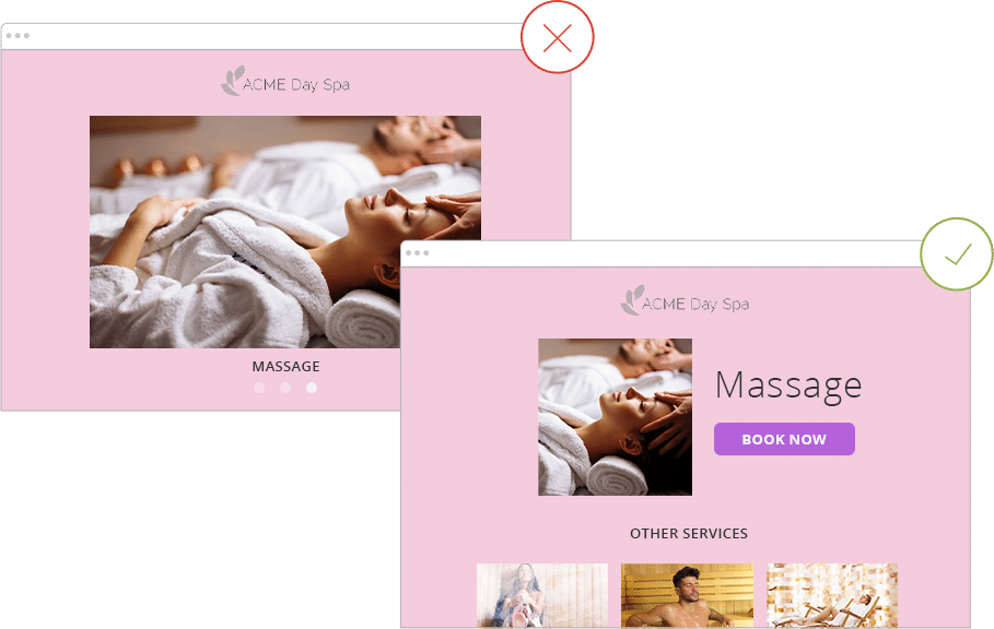
Instead of a carousel, decide which content is the most important and show it in the header, then include the other content you were considering for your carousel slides below your header content.
Don’t use large images that lead to long loading times
Of course, keeping loading times low for your landing page might be obvious. However, it isn’t always clear to folks what might be causing slow-loading pages. Often, large image sizes are the culprit. When choosing images for your landing page, make sure they are sized appropriately for the web.What does it mean to size an image for the web? First, look at the pixel size of the image. You probably don’t need to use an image that is 3,000 pixels wide, as most people won’t be using screens that big. Instead, keep your image widths at 2,000 pixels or less. This allows people on wider screens to still get the full experience.Next, consider the file size of the image. To increase loading speeds, try keeping your image file sizes lower. One way to do this is to use images that are web-quality instead of print quality. Are you using images saved at a resolution of more than 72 dpi? You don’t need to! Downsize the resolution to decrease the file size and decrease loading times.A final consideration is the type of file. For example, .png files work well if you’re trying to use an image with transparency. However, if that isn’t your goal, you may consider using a .jpeg image instead. Jpeg files are generally smaller in size than .png files.

Be sure to size your images appropriately for web for faster loading times.
Don’t create a false footer
What’s a false footer? False footers occur when the content either appears to end or a visual cue indicates to the viewer that the bottom of the page has been reached, but there is still content below to be seen.You most commonly see this when the header area on a website doesn’t have any additional content peeking out “above the fold.” Sometimes, you’ll even see very dark bars used across the screen to break up content; however, many people would interpret this drastic change as the end of a page.To avoid this issue, make sure your content is broken up in a way that leads the viewer to continue scrolling. For example, you could use color blocking to signal that the end hasn’t yet been met. Alternatively, never allow your page sections to be so tall that a bit of the content from the section below isn’t peeking out when the user scrolls down.
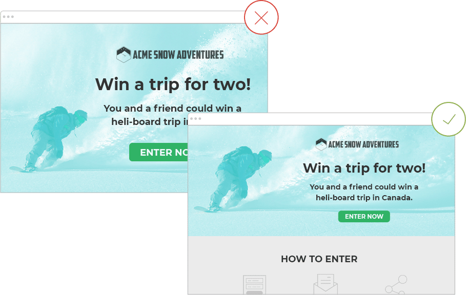
Make sure your content is broken up in a way that leads the viewer to continue scrolling
Don’t hide your CTA
Your call to action (CTA) is probably the most important piece of your website. Don’t hide it! Website visitors remain on the page for an average of 15 seconds. Keep your CTA “above the fold” so your customers can see it immediately upon visiting your landing page. Placing the most important content at the very top of your landing page helps visitors decide quickly if what your business provides is what they’re looking for.
For more information on CTAs, readDesign Tip: Designing compelling call to action buttons for your landing page.
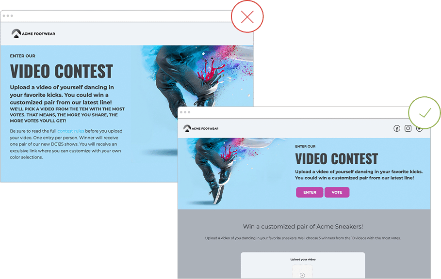
Don't hide your CTA below the fold
Don’t use jargon
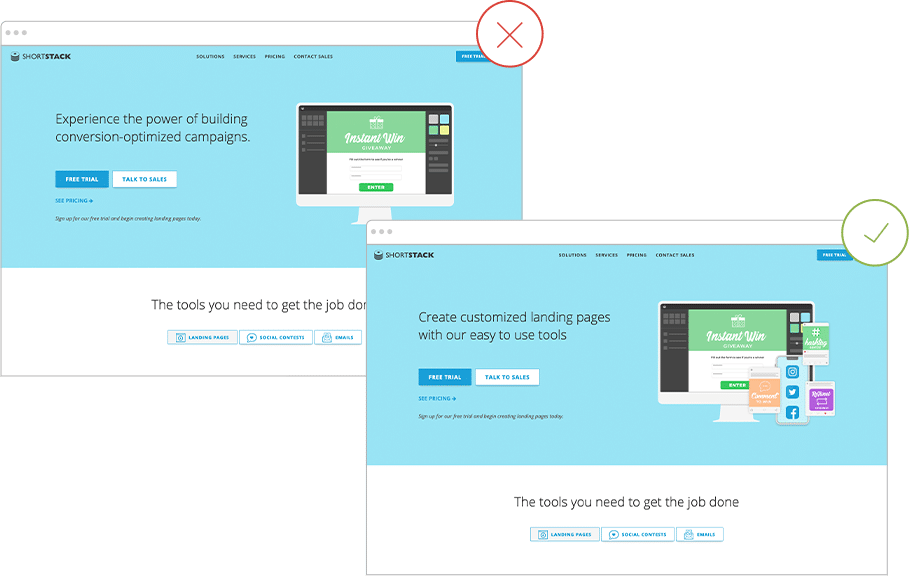
Probably the hardest thing for any marketer is this last don’t -- avoiding jargon. In fact, I know it’s something our team struggles with due to our intimate knowledge of our own platform. When writing copy for your landing page, try to remove any jargon, technical terms or abbreviations that might seem obvious to you but are difficult for your customers to understand.A good way to think about this is to imagine you didn’t know anything about your business. Does what you’re writing clearly communicate to someone what you’re trying to explain? Better yet, try to write in terms of the value you can provide your customer, instead of hitting them over the head with all the fancy technical stuff.

When writing copy for your landing page, try to remove any jargonNow that you know some of the major issues to avoid when creating your landing page, why not check out more suggestions on our Design Tips page? It’s packed with additional information to help you and your team create landing pages that convert visitors into customers.
Create your first landing page now
Get Started Today Sign up for our free trial today. No commitments, cancel anytime.


