7 Things You Must Do When Building Landing Pages that Convert

ShortStack.com creates landing pages to target specific audiences and highlight features of their software, like analytics reports and hashtag contests.
Landing pages
- individual web pages that are separate from a company’s main website
- are a way to target specific audiences and prime them to buy what you’re selling (so to speak).
At ShortStack.com, we create landing pages to highlight specific features of our software, like our analytics reports and our popular hashtag contests. We also create landing pages that correspond with certain Facebook ads and PPC display ads we’re running. If you’re not using landing pages as part of your inbound marketing strategy, you could be missing out on lots of opportunities: Landing pages can help you segregate audiences because they give you a place to craft distinct messages that’d be hard to place on your main website.
For example, you can create landing pages with language that touts benefits for potential customers that run or own small businesses and other pages that target enterprise-level operations. Landing pages also make it easy to perform A/B tests so you can fine tune your messaging based on trends you see on different pages. And they let you collect data from specific audiences. Finally, landing pages can help with SEO.We have two new templates to help you build lead-collecting landing pages. Just log in to your ShortStack account and you'll see them in our template gallery.


Now that you see some of the benefits of using landing pages, here are some things to keep in mind when you build them.
1. Create a custom URL
There are lots of tools you can use to build landing pages (ShortStack is, obviously, my favorite) but whichever platform you use, make sure it lets you create a custom URL for each page. In one of the examples I noted above, we created a URL called “shortstackanalytics.” The key is to use descriptive words in your URL without stuffing it full of keywords (for which you might be penalized).
2. Make sure branding is consistent
When a visitor clicks from an ad to a landing page, or from a landing page to your main site, the transition should feel seamless. The color scheme, the fonts, the logo, the layout, and even the tone of the messaging, should be aligned with your overall web presence. The last thing you want is for people to feel like there’s been some sort of bait and switch once they've moved from an ad to a landing page, or from a landing page to your website.
3. Keep the design simple
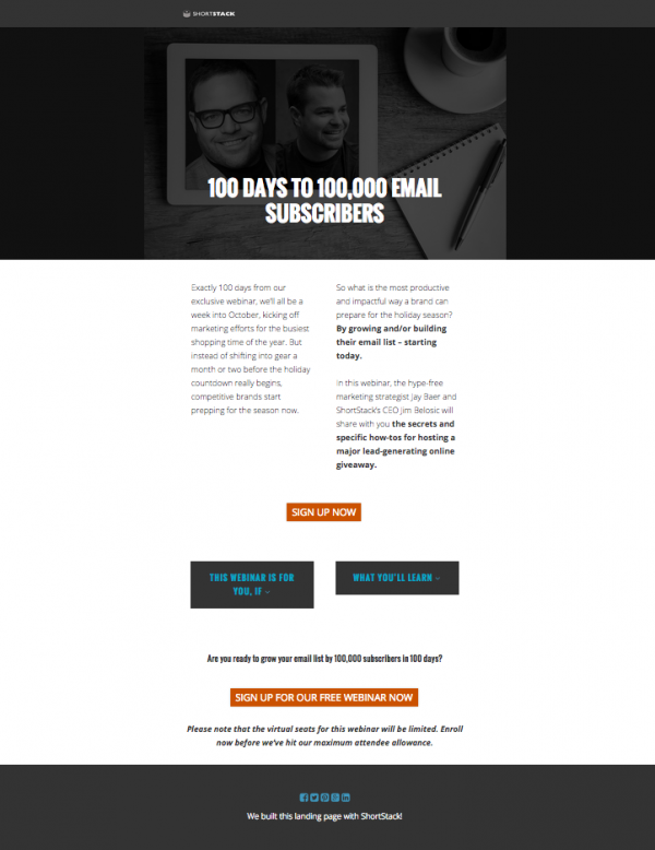
Don’t try to be too many things to too many people. Actually, this is one of the beauties of having multiple targeted landing pages, you can get really specific because a landing page is, after all, a single page. Avoid having multiple social icons, unnecessary links and tabs, drop-down menus, etc., because having too many “features” on a landing page will only confuse your visitors. Remove any information, clickable link or button, that does not support the overall goal of your landing page. Why? Having too many options will be distracting for your visitors and they may bounce, without having done what you want them to do. In the example below, a landing page we built to promote a webinar we were co-hosting, you'll notice it's very clean and leaves readers with little doubt as to what we want them to do: sign up for our webinar!

4. Make sure the page(s) look good on mobile
Recently, Google announced that the majority of its traffic comes from mobile. If you're designing landing pages that look gorgeous on a desktop but not as great on a smartphone or tablet, visitors will abandon the page. Having mobile-ready landing pages is especially critical if there is a form involved. No one is going to take the time to fill out a form from a mobile device unless the form is really easy to fill out. While we're talking forms, keep the number of fields to a minimum. This is good advice in general (and especially important for social media contests), since the abandonment rate can be as much as ten percent per field.
5. Communicate your message - quickly
Keep your copy concise! This is an extension of “simple design. ” Within a couple of seconds of arriving on your landing page, visitors should have answers to the question that brought them to your page in the first place. If you have calls-to-action on your landing page, make them very direct: “Click here to learn more,” “Schedule a demo,” “Get started, it’s free,” etc. By the way, messaging is another thing you should always be A/B testing. By comparing pages that have more or less copy, you will learn what kinds of messaging your potential users respond best to.
6. Make sure there’s something in it for your visitors
In order for your visitors to fill out the form or click the call-to-action button, they will need some motivation. Will they get access to a free eBook, PDF or other valuable resource? Are you offering a coupon with a discount to one of your products? Free shipping? Free samples? Make sure the incentive is clear.
7. Make sure there’s something in it for you!
Landing pages are often used to collect data. But there’s no point in collecting email addresses or demographic information if you don’t know what you’re doing to do with it. Are you building an email list? Scheduling one-on-one demos of your product? Gauging interest in a new product or service? Make sure you know what your goal is from the get go. You've heard the saying "Begin with the end in mind?" It's especially important with landing pages since you have just a few seconds to get visitors to take the action you want them to take. How do you use landing pages? I'd be curious to hear what part they play in your inbound marketing strategy.


