The 5 Best Landing Page Design Ideas for the Holidays
Learn how to create effective holiday landing pages by incorporating familiar characters, holiday colors, visual cues, real photos, and themed products.
The holiday season is unlike any other time of the year… The music on the radio changes, decorations line the streets, and marketing your business becomes a little different. Yes, this time of year presents a huge opportunity for consumer-facing businesses due to the increase in spending. But it also poses a significant risk. You are fighting for the attention (and disposable income) of customers at the same time as every other business. Competition is fierce and standing out is hard. One way you can cut through the clutter and earn the attention of your audience is to be creative with your campaign landing pages. Whether you’re running a flash sale, launching a new product line, or hosting a holiday giveaway, the landing page is the hub of your efforts. If you effectively engage and convert prospects when they visit this page, your campaign will be a success. If you don’t, it may simply be a burden on your resources. So, how do you get creative with the design of your holiday landing pages? Here are 5 holiday marketing ideas with examples from high-performing campaigns.
#1. Familiar Characters
This phenomenon is what I like to call the “psychology of Santa Claus”...

Psychological studies reveal that repeated exposure to certain people, characters, or figures increases our attraction towards them. Basically, the more we see someone in a familiar setting, the more we will trust them.
On a small scale, this is why you build trust for those you see on a day-to-day basis. Maybe it’s the person you buy a coffee from in the morning, or perhaps it’s your bus driver.
Despite not really “knowing” these people and their backstories, you feel comfortable in their presence and are willing to trust them with certain aspects of your livelihood.From a societal perspective, the psychology of familiarity has a much greater effect on our behavior.
It’s why we are drawn to recognizable characters such as Santa Claus, the Easter Bunny, or even celebrities. Justified or not, we trust businesses and products based on how familiar they feel to us.
This may be due to our experience or it could be by association with a friend, family member, or even a trustworthy character like the ones I have mentioned above.
This concept of familiarity extends beyond just trust-based decision making. For example, something familiar to us is far more likely to catch our attention than something we have never seen before.
There are only so many objects, colors, or figures our mind can process as we observe our surroundings.
Naturally, we pick out the things that reinforce our beliefs and confirm our understanding of the world.
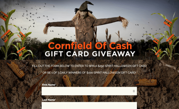
An example of using the psychology of familiarity in your holiday landing pages would be to use recognizable characters such as Santa Claus, or in the case below, a scarecrow, to grab people’s attention.
#2. Holiday Colors
Color psychology is regularly used in marketing materials to draw a viewer’s attention to the most important information - be it a product benefit, deadline, or call-to-action. But the use of color goes beyond highlighting selling points.Here are some ways color is used in marketing:
- Complementary but contrasting colors make things stand out. For example, orange and blue are opposites that work in unison.
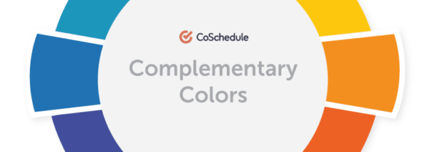
- An example of a contrasting color combination.
- Every color has its own meaning depending on the context in which it is used. For example, the color red can relate to fear, speed, or courage, depending on the circumstances.
- Colors allow us to set the mood and tap into our customers’ emotions. For example, the color yellow is considered warm and joyful, whereas green is about healing and the Earth.
- Colors are associated with familiar events, experiences, brands, and feelings, which means we can use them to transport people to these moments. For example, many people associate the contrasting interplay of white and black with Apple products, or green and red with Christmas.
The last point in this list is how you can use colors to elicit emotions and catch the attention of your audience during the holiday season.
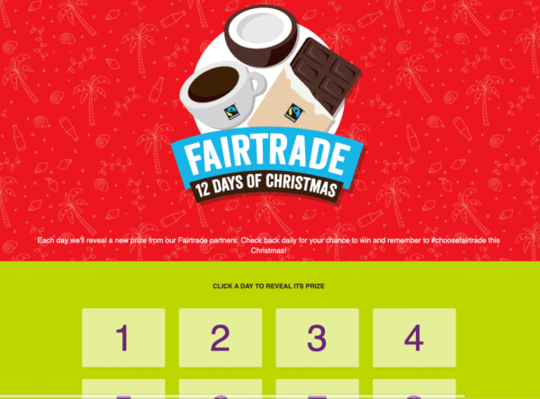
For example, this holiday landing page from Fairtrade’s “12 Days of Xmas” promotion, uses contrasting Christmas.
#3. Visual Cues
Much like the colors you use to highlight certain elements of your landing page, there are other visual cues and tactics which will have a similar effect.
For example, marketers often use text-based visual triggers to attract your attention. This may be as simple as capitalizing a phrase, underlining text, or bolding an important word.
However, what is even more powerful, is the use of differentiating fonts. By using a basic font for a majority of the text on your landing page, you can highlight important words and phrases with something a bit more extravagant.
The Halloween landing page below does exactly this with the “Nights of Fright”.
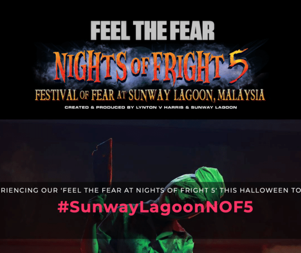
Another visual cue that is commonly used to spice up a holiday season landing page is iconography.
Much like fonts and colors, icons have a way of conveying a lot of information in a very small amount of space. For example, the Christmas landing page below uses gingerbread houses, stockings, and other icons to help people immediately relate to the purpose of the page.
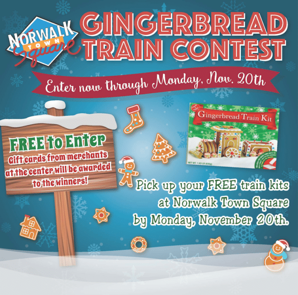
You could even combine these two visual cues for an even greater impact.
For example, this landing page uses both icons and different fonts to get people in the mood for Halloween.
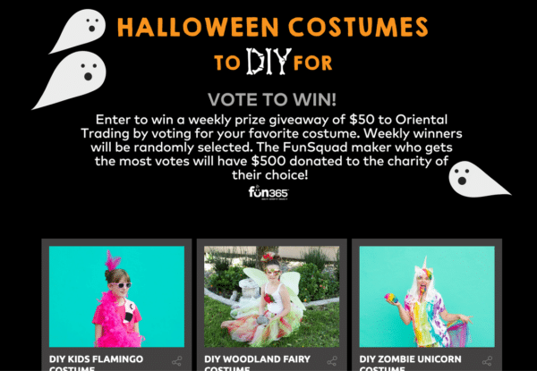
#4. Real Photos
So far I’ve discussed landing page design elements that are inanimate such as colors, icons, fonts, and characters. The problem with creating a website experience made up of only these components is that it lacks the human touch. People connect with people, not icons, colors, and caricatures. Sure, these things can emphasize the emotions and actions of a visitor, but for best results, your landing page should also include real photos. In-depth research has been conducted into the influence of real (predominantly human) photos on landing pages and whether or not they improve conversions. In short, they do. Considerably. So when it comes to the design of your holiday campaigns, find a way to utilize real photos of your staff, customers, or even your products, so that potential customers can easily align the website experience with their real-life expectations. This “Holiday Makeover” landing page comes across as warm and relatable, predominantly due to the smiling face of a person taking center stage.

On a more subtle level, this landing page from Perky-Pet has used a real photo of a Christmas tree.
While not as impactful as a photo of a person, the placement of a real photo on the landing page helps visitors draw real-life connections with the business.

#5. Themed Products
What better way to capitalize on the holiday season than by creating themed products?This may sound like a lot of work and investment, but it doesn’t have to be. Not to mention, event-themed products are known for being big sellers. To create a themed product all you really need to do is switch up your packaging and give your best-selling products a different name. Starbucks is one example of a business that makes the most of themed products throughout the year, but most prominently during the holiday season, by changing their packaging.
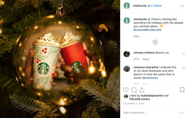
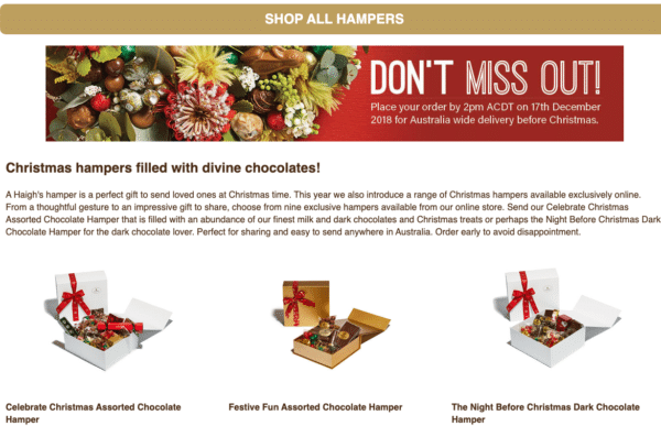
How Starbucks use themed products in the holday season. Haigh’s Chocolates developed a huge range of Christmas chocolates; using green, red, and gold packaging, and offered them as holiday hampers.
Or, for a slightly different bit of inspiration on creating themed products, gift delivery company, Edible Blooms, ran a Christmas giveaway where entrants could choose between a selection of themed prizes.
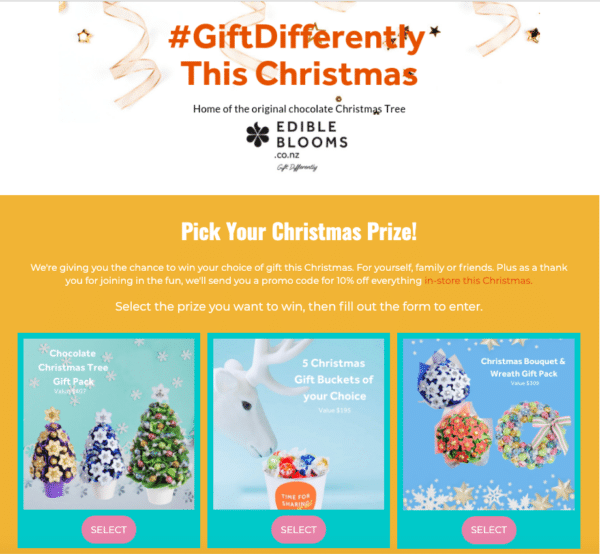
Themed products help get your landing page visitors in the spirit of the season and ready to take action.
Conclusion
Are you ready to make the most of the holiday season?Be careful not to take this opportunity for granted.
While your holiday customers are ready and willing to spend at this time of year, your competitors are just as eager to attract their attention.
When creating your holiday landing pages, combine real photos with familiar characters and include holiday colors, and other visual cues to see conversions increase.


