Step by Step Guide to Building a Landing Page
Learn how to build a professional landing page without hiring an expensive web designer. Convert more customers and avoid common pitfalls.
Landing pages can be a crucial step in a high-converting sales funnel. But for retailers, small business owners, and some marketers, you may think hiring an expensive web designer is the only way to get professional results.Much like so many other mediums of content creation, there are tools to help you build and publish landing pages. The best part? The end result can look just as good as if it were built by a pro.But, if you’re new to the landing page-creating game, there are a few steps that you might overlook. In this guide, learn how to build a landing page from concept to creation while implementing strategies to help you convert more customers and avoid common pitfalls.
Before diving in, why are landing pages so beneficial?
Let’s say you walk into a department store with the intention of buying a new pair of shoes. You’re not quite sure where the shoe department is so you make a beeline through menswear, pass the makeup counters, and, hold the phone…. you see a sale on comforters. You stop to take a peek, and before you know it, you have to leave to meet your friend for lunch.This dilemma is the perfect metaphor for what befalls your website visitors as well. When someone arrives at your website with something very specific in mind, it’s too easy to get distracted by the price list or employee bios. Before you know it, your phone’s ringing or your meeting is about to begin and you’re forced to bounce without getting what you had originally come for.Now, go back to the shopping example. If you had walked into a shoe store instead of a whole department store, the time it took you to wander around and look at comforters could have been spent solely looking at shoes. It’s entirely plausible you would have found a perfect pair and walked out with your mission accomplished.In this scenario, the shoe store is your landing page which is a highly focused piece of content. It allows you to target a very specific group of people that have arrived at your landing page for a very specific purpose. In other words, it’s a powerful tool in moving potential customers along your sales funnel and increasing their odds of conversion.Now that you have an understanding of their purpose, let’s dive into building a landing page of your very own.
Step 1. Think about a few things.
As illustrated in my department store vs. boutique shop scenario, your website is a hub for all information related to your business - products, hours, location, prices, history, staff bios, and on and on. Whereas, a landing page should be highly focused on one purpose. For example, if you’re running a summer promotion, the landing page would explain the details of your promotion and then include a button or CTA (call to action) as to what to do next.In this first step, think of the goal you’d like your landing page to achieve, whether that be to deliver your visitors to an online store or have them click a button to book an appointment. This goal will shape the rest of your landing page journey.
Step 2. Write some copy
When writing copy, the name of the game is to keep it clear and simple. The most important copy you’ll write for your landing page is the headline and the CTA - the element that will take visitors to the next step.Here’s a great example of a landing page from Hello Fresh. The headline says it all - you can get free meals from the best service of its kind. What could be better? If you’d like to take the next step, the call to action couldn’t be more clear. Click the button to get your 14 free meals.
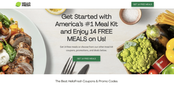
If you follow the principle of keeping your copy clear and simple, it will help you avoid another major pitfall - writing too much. You only have a few seconds to capture your visitors’ attention. With too many words on the page, the message will get muddled and your visitors are sure to bounce.Not to mention, 80% of visitors don’t scroll below the fold. Meaning, all of the space that is visible without scrolling down the page is the only real estate you have to get your message across to the bulk of your audience. You can use more space, but make sure your message is clear without it.SEO (search engine optimization) is something else you should think about when writing copy. If you’re not going to use PPC (pay per click) ads to boost your search rankings, then optimizing your page is a must.If you’re new to optimizing your content for search engine “crawlability,” it will be worth the time and effort to learn a few basic principles to help boost your page’s ranking.
Step 3. Build and publish your page
If you’re reading this article to learn how to build a landing page, it’s probably safe to assume that graphic design is also not your profession. And that’s ok! There are plenty of online resources to help you design a professional-looking landing page, including templates to help you get started.Check out this gallery of templates where most of the work has already been done for you. Then, make sure to follow a few basic design principles and you’ll find that this part may be the easiest part of the landing page building process. Not to mention, the most fun.
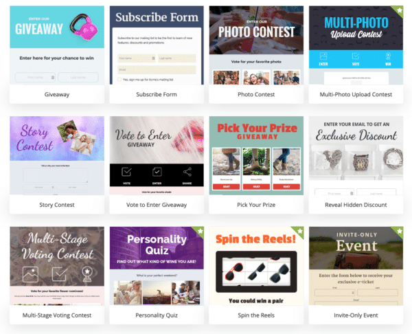
A few of the many templates ShortStack offers[button size='medium' style='white' text='View Templates' icon='' icon_color='' link='/templates' target='_blank' color='' hover_color='' border_color='' hover_border_color='' background_color='' hover_background_color='' font_style='' font_weight='' text_align='' margin='0 0 10px']When it comes to building and publishing, tools like ShortStack.com not only offer templates that make the building part a breeze, they also allow you to get your landing page live on the web with just a few clicks. If you’re not versed in creating a domain and updating the DNS, a service like ShortStack (who also takes care of the hosting!) may be the perfect solution.
Step 4: Create more versions of the same landing page
You may be scratching your head at this one, but one thing the pros do lots and lots of is test different versions of their marketing elements to see which performs the best. It’s called A/B testing. If you’ve followed our lead and decided to use ShortStack.com to build your landing page, creating more than one version of your page couldn’t be easier to do. Simply make a copy of it and change a few things you’d like to test.One thing you should test on your page is different versions of the CTA. For example, Hello Fresh may test “Get 14 Free Meals” against something like “See Sample Menus” or “Sign Up Now.” You can also test different imagery, headlines, and even things that seem trivial such as button colors and fonts.
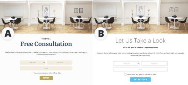
One way to track which page performed the best would be to set up two identical ads using two identical audiences. Then, link each ad to a different page. The page with the most conversions will tell you which elements performed the best, giving you valuable insight as to how you should build your page the next time around.
Step 5: Follow up
Even after your landing page is built, copied, and launched, something even the pros are guilty of is not following up on the data that’s collected. So often multiple versions of a landing page are released into the wild but no one ever looks at the analytics to see how they performed. It’s like climbing a mountain and turning back just before reaching the summit. As I mentioned in step 4, the test data is going to reveal elements that will make you a better communicator to your audience. If you did the work to carefully plan, build, launch your landing page and set up A/B testing, make sure you understand the picture the results of that effort painted for you.Also, if your landing page collected data from visitors using an entry form, don’t let that data sit there and collect dust (so to speak). Use it to frame a follow-up email, or, heck, a series of follow-up emails to stay in touch. Keeping your business at the forefront of a prospect’s mind is a crucial step in converting them into a customer.
In summary
Use a landing page as a focused piece of content to drive a targeted audience towards conversion. With a little planning and the right tools, you can build a professional-looking landing page that does the job of helping you realize your goals. But the work doesn’t stop there. By A/B testing a few versions of your page and using the data you collect in future marketing efforts, your landing pages can become much more than a conversion tool for a one-off promotion. They can help you achieve a much deeper understanding of your audience and also cultivate a base of loyal customers that keeps the revenue rolling in.
Create your first landing page now
[button size='large' style='' text="FREE TRIAL" icon='' icon_color='' link='http://designer.shortstackapp.com/apps?template_gallery=true&utm_source=Blog%20Footer&utm_medium=Common' target='' color='' hover_color='' border_color='' hover_border_color='' background_color='' hover_background_color='' font_style='' font_weight='' text_align='' margin='20px 0 0']Sign up for our free trial today. No commitments, cancel anytime.


