Field Widget
The Field Widget adds input fields, such as name, email or your own custom questions, to a Form Container in your campaign. Visitors fill them out and use the Submit button to send their information. Add it from the Add Widgets panel in the Campaign Builder.
Before you start
Every plan can use the Field Widget. A Field Widget always sits inside a Form Container Widget, so add a Form Container first if your campaign doesn't have one.
To enter entries yourself, fill out the form inside the Campaign Builder, and use the Form Container's visibility settings to hide it from the live campaign.
Adding the Field Widget
- Find the Field Widget icon (a form with lines) in the Add Widgets panel.
- Click the icon, or drag it into a Form Container Widget in the Edit Widgets panel.
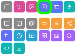
The widget's settings open automatically. To open them again later, click the pencil icon on the Field Widget.
Widget settings
At the top of the settings window you can rename the widget and find its CSS ID.
- Name: click the pencil icon in the top-left corner, next to the widget name, and enter a new name. By default, the name matches the field type you select.
- CSS ID: the ID, starting with
#, appears in the top-right corner of the window.
Field type
The Field Type section is where you choose what the field collects. There are two kinds:
| Kind | How you can use it |
|---|---|
| Standard Fields | Use each one once per list. |
| Custom Fields | Use them as many times as you like. They are saved to your Field Library, and you can hide them from the live form. |
Selecting a standard field
- Click the field type you want.
- Configure the field in the Field Settings section.
After you use a standard field type, it is greyed out for the other fields in the same Form Container.
Selecting a custom field
- Choose the field type.
- To reuse a custom field you created earlier, select it on the right-hand side. Otherwise, configure a new one in the Field Settings section.
- To collect information the entrant doesn't see, select the checkbox to make the field hidden.
- Save the field to your Field Library so you can use it again.
Using the same custom field twice
You can place the same custom field twice on one form. Both fields then change together as the entrant answers, because they share one ID. If you want them to collect separate answers, give one of them a new ID.
To check a field's ID, look at the bottom-right corner of its settings. In the example below, the field ID is custom_text_52.
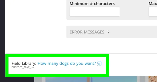
Learn more in Making copies of Field Widgets.
Field settings
The Field Settings section is where you configure most of the details of your field. The settings depend on the field type. Select the expand icon (▸) to open a collapsed subsection. Common subsections are:
| Subsection | What it does |
|---|---|
| Layout | Chooses a layout, when the field type offers more than one. |
| Text | Sets the Labels and Placeholders of the field, where the field type has them. |
| Validation | Sets whether the field is required (see below). |
| Error messages | Sets the messages visitors see when their answer isn't accepted. |
| Field points | Assigns points to the field. Entrants earn them when they complete the field. |
| Other | Instructions shows text below the field when it is selected. Extra CSS Classes adds one or more CSS classes so you can change the field's appearance with custom CSS. |
Choosing when a field is required
In the Validation subsection, choose one of three settings:
| Setting | Use it when |
|---|---|
| Always | Every entrant must answer. |
| When visible | The field can be hidden part of the time, for example inside a container that starts hidden. Entrants answer it only when they can see it. |
| Never | The field is optional. |
If a field is set to Always but is hidden, either by its own Starts Hidden setting or by its parent container, a warning icon appears next to it in the Edit Widgets panel. Click the icon to change the setting to When visible.
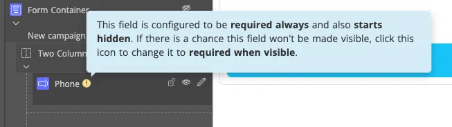
When you add a new Field Widget inside a Starts Hidden container or Form Container Widget, ShortStack sets it to When visible for you, so that hidden fields don't block your entrants from submitting.
Visibility
Use the Visibility section to control when and where the field appears. You can:
- Set specific dates and times.
- Show the field only in the Builder.
- Limit the field to visitors from certain countries.
Learn more in Widget visibility.
Extras
To learn about the Main Tag, CSS Classes and Smart Labels settings, see Widget extras.
Styling the Field Widget
Select the widget to style it. You can change, for example, the input box color, the maximum width of the widget, the label font and the widget alignment. The Style Panel has four areas for this widget:
- Labels
- Input Box
- Help Text
- Widget
If something goes wrong
You see "Action Needed" when you add a field. The full message is Field widgets must be enclosed inside a form container widget. A Field Widget has to sit inside a Form Container, so choose Add Form Container Widget in the dialog, then add your field to it.
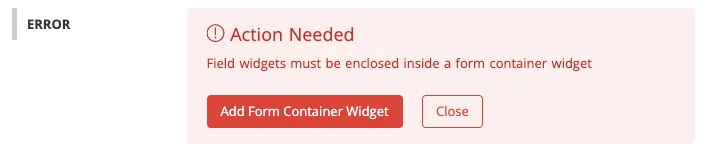
A standard field type is greyed out. You've already used it in this Form Container. Use a custom field when you need the same kind of question again.
Two fields change together. They share the same ID. Give one of them a new ID, as described in "Using the same custom field twice".
Related resources
The Best Types of UGC to Collect and Use (Blog)
Was this helpful?
Thanks — that helps us decide what to fix next.
Sorry this missed. Tell us what you needed and we'll get you an answer — and fix the page.