Image Widget
The Image Widget displays a single image in your campaign, automatically scaling to fit different screen sizes. You can also set the image to link to a website or trigger an action (similar to links in the Buttons Widget).
Overview
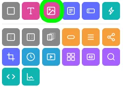
Adding the Image Widget
To add the Image Widget to your campaign:
- Click the Image Widget icon in the Add Widgets Panel, or
- Drag the icon into your preview area.
Widget settings
The widget settings pop-up allows you to customize your Image Widget.
Renaming the widget
- Click the pencil icon in the top-left corner (next to the widget name).
- Type the new name and press Enter.
CSS ID
The CSS ID (starting with a #) is displayed in the top-right corner of the pop-up.
Customization
Navigate through the menu on the left to adjust settings. Use the Back and Next buttons to move between sections. When finished, click the blue Save and Exit button.
Setup (selecting an image)
To add an image to your widget, click Select Image in the Setup section.
Note: Maximum file size: 10MB. Accepted file formats: PNG, JPG, and GIF
Choosing an image from the media library
The image is already in your library
- Click the thumbnail to select it (it will be highlighted in gray).
- Click Use Selected.
Upload a file from your desktop
- Drag and drop the file into the Media Library
- Once uploaded, click the image and select Use Selected.
Upload via file selection
- Click Select Files in the top-right corner.
- Choose the file from your computer.
- Highlight the image and click Use Selected.
Upload an image via URL
- Click Enter URL in the top-right corner.
- Enter the image URL and click Upload.
- Select the uploaded image and click Use Selected.
Use an image from Pixabay
- Click Pixabay at the top of the Media Library.
- Choose an image and click Save to Media Library.
- Go back to Media Library, select the image, and click Use Selected.
Learn more about the Media Selector.
Options
The Options section allows you to configure text associated with the image:
- Alt Text: Describes the image when it cannot be displayed.
- Title Text: Provides additional information, shown as a tooltip in some browsers when hovering over the image.
Note: Both Alt Text and Title Text enhance accessibility by enabling screen readers to describe the image for users with visual impairments.
Visibility
Control when and where the widget appears using the Visibility section.
Options include:
- Setting specific dates and times for visibility.
- Displaying the widget only in the Builder.
- Limiting visibility to certain countries.
Learn more about Widget Visibility.
Extras
Learn about the Main Tag, CSS Classes, and Smart Labels settings here.
Carousel images
ShortStack's Image Widget does not support carousels.
Image Widget styling options
When the Widget is selected, you can customize the styling of the specific widget. Some of the options include changing the background color, the maximum width of the widget, and widget alignment. You will see the following areas of styling available in the Style Panel:
- Widget Visibility
- Widget Background
- Widget Spacing
- Widget Borders
- Widget Text
Related resources
Was this helpful?
Thanks — that helps us decide what to fix next.
Sorry this missed. Tell us what you needed and we'll get you an answer — and fix the page.