Getting started with the Style Panel
The Style Panel is a powerful customization tool within the Campaign Builder that allows you to make design adjustments to your campaign’s theme.
Overview
Note: If you’re looking for recommended dimensions for images in your campaign, check out our Image Size Guide for detailed information.
Accessing the Style Panel
New Campaigns or Templates:
The Style Panel will be open by default when starting with a new template or campaign.
Toggling the Panel:
Open and close the Style Panel by clicking the Style Panel icon  in the toolbar on the left.
Using the Style Panel
The default view of the Style Panel displays settings for the current theme under the Theme tab. You can navigate to different sections by clicking the blue dropdown.
Theme settings
General: Adjust settings for the entire campaign.
Widget-Specific Settings: Customize all widgets of a specific type.
Individual widget settings
To make changes that only apply to a specific widget:
- Click the widget in the Edit Widgets Panel.
- A new tab, This [Widget Type], will appear in the Style Panel.
- Open the relevant section to make your edits.
- Click Save to lock in changes.
Undo/Redo Changes: Use the undo and redo icons at the bottom of the Style Panel to reverse or reapply changes.
Clear settings
For a Specific Widget: Click Clear # Settings for this Widget to reset changes.
For All Settings: Click Revert to Default to clear all Style Panel customizations.
Hierarchy of changes
General Settings: Applied across the entire campaign.
Widget-Level Changes: Override general settings for specific widgets.
Custom CSS: Overrides both general and widget-specific changes.
Creating themes
Save your campaign’s design elements as a theme for reuse:
- Click the three dots menu in the bottom-right of the Style Panel.
- Select Add to My Themes to save the current design.
Note: Changes made to themes are unique to individual campaigns.
To save a modified theme as a new version, give it a different name.
To override an existing theme, save it with the same name.
Glossary of design terms
Inherit
Refers to the default theme style set in the General settings. Selecting Inherit reverts the element to the default style.
Margins vs. padding
Margin: The outer space around a widget.
Padding: The inner space within a widget.
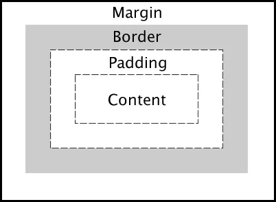
Style Panel layout
The Style Panel includes several sections to customize your campaign's appearance. Here’s an overview of the most commonly used sections:
Colors
Color Swatches: Add custom colors to ensure consistency throughout the campaign.
Page
Background Color: Set the background color for the entire campaign.
Background Image: Upload an image (recommended size: at least 1800 pixels wide).
Background Repeat: Choose between no repeat, horizontal repeat, vertical repeat, or tile.
Background Size/Position: Adjust the size and alignment of the background image.
Padding: Customize the space around widgets (default: 0.1px).
Maximum Content Width: Set the width for content in your campaign.
Text
Text Color: Change the color of all text.
Font Size: Adjust the default font size (default: 16 pts).
Alignment: Choose from inherit, left, center, right, or justified.
Font Family: Select a font supported on all browsers.
Font Weight: Adjust the boldness of text.
Line Height: Customize vertical spacing between lines.
Links
Text Color: Change link text color.
Font Size/Family/Weight: Adjust the size, font, and boldness of link text.
Text Underline/Case: Add styles like underline or change text to uppercase/lowercase.
Hover Effects: Set hover-specific text color, boldness, and underline effects.
Buttons
Customize all buttons, including those in the Voting Widget.
Background/Text Colors: Set background and text colors.
Padding: Adjust spacing around button text.
Borders: Add styles, colors, sizes, and rounded corners.
Hover Effects: Customize hover-specific background, text, border, and shadow colors.
Widget defaults
Apply universal settings for all widgets.
Background/Margins/Padding: Adjust colors and spacing.
Borders: Add styles, colors, sizes, and rounded corners.
Box Shadow: Add shadows behind widgets.
Pop-ups
Background Color/Opacity: Customize the area behind pop-up windows.
Content Background: Adjust the color within the pop-up.
Padding: Customize spacing between content and the pop-up border.
Text: Adjust color, size, font, and boldness of text in pop-ups.
Pop-ups with forms
Specific settings for pop-up windows with forms.
Label Text/Error Text/Help Text: Adjust colors and font sizes.
Form Field Styling: Change border and background colors, input text colors, and hover effects.
Button Styling: Customize form buttons, including hover effects.
Related resources
Was this helpful?
Thanks — that helps us decide what to fix next.
Sorry this missed. Tell us what you needed and we'll get you an answer — and fix the page.